More on passwords

When I went to BJ’s  to create an online account, I dutifully created a password with at least eight characters, including at least one letter and one number. As standard practice, I also include a punctuation mark, making password cracking that much more difficult.

99.wharlG

BJ’s took exception to my choice. but did so only with a suggestion.

If a password should only contain alphabets (sic) and numerics, (sic+1) etc., then I would still be permitted to use punctuation characters against their advice. Grumble, grumble.


One of an occasional series.
A bunch of years ago, I worked for a software company. It was hard work for long hours. At one point, senior management made the pronouncement that the development team needed to focus more on a particular aspect of the product. The QA manager and I agreed that we’d be Focused More-ons.

Abbreviated education

UMass offers online undergraduate and graduate programs. To learn about the programs, you need to fill out a form and select the program(s) that interest you before you can download a brochure.
The form lists several programs, including some with long names that are truncated by the form window. Too bad. I was wondering what a degree in Education Specialist Degree in Curriculum and I might encompass.

But, wait, there’s more. If you view the source of the page, you can see the full description of the programs. You also see, but without explanation, that the form page starts with 147 blank lines.
If you stumble around the site, you can also find out more about the programs on their Programs page.

Fixing software with documentation at Harvard

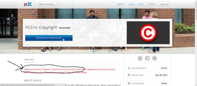
Much has been made of Harvard School of Law’s online course on copyright law. The course, given by Professor William Fisher, covers a range of topics related to the theory and application of copyright law in the U.S. and other countries. The course is limited to 500 attendees, participating in groups of 25, giving a small-class feel to a massive open online course.
Registration closed on January 3. As a result, we are told to ignore the big registration button on the course page.

Please note that the "Register" button above is not used for HLS1x. The application period is now closed, please see the section "When should you apply?" below for more details.

This is what we call Fix It in Documentation. The way that the HTML page is stitched together, the registration button is one component while the course description below is another. It works well until it doesn’t. Apparently, there isn’t a way to disable or otherwise change the display once the registration period has passed. So, two sentences in red text tell you that they couldn’t change the button and that you can’t do what the button says you can do.

Beware the unmatched brace

I’ve been tinkering with the new WordPress Twenty Twelve responsive design template for a couple of other sites that I maintain. Given the increased use of mobile devices, such as phones and tablets, websites have to accommodate those smaller displays. Doing so with multiple style sheets for each possible configuration is possible but a testing and maintenance nightmare. Responsive design templates, where smart people figure out this stuff for us, are the easiest way to get to a good common solution.

The basic Twenty Twelve design, admittedly, is a bit bland. It has a quirk of placing the header image below the website title and tag line.
It also puts a box shadow, albeit faint, around the image.

I cloned the default template, moved the image above the title, and then set about to remove the box shadow. All that I’d need to do is reset the value of header-image in the style sheet.

img.header-image,
{
box-shadow:none;
}

WordPress offers a built-in style editor so that you can make changes to your design as you go.
In a simple case such as this, little can go wrong. If you are making a bunch of changes, however, you discover that it’s easy for an extra character can wander in during a copy-and-paste editing session.
The code editor doesn’t do syntax highlighting. As a result, if you leave an open curly brace:, the style sheet will fail silently and you’ve left with a simple change that doesn’t work.

{
/* a bunch of code copied from elsewhere
that goes on for a while and then is missing a closing brace.
*/
img.header-image
{
box-shadow:none;
}

Tip: if you’ve spent what seems like an inordinate time tracking down a style change that’s not working, copy your code into a proper editor and let it help you see what you’re missing.